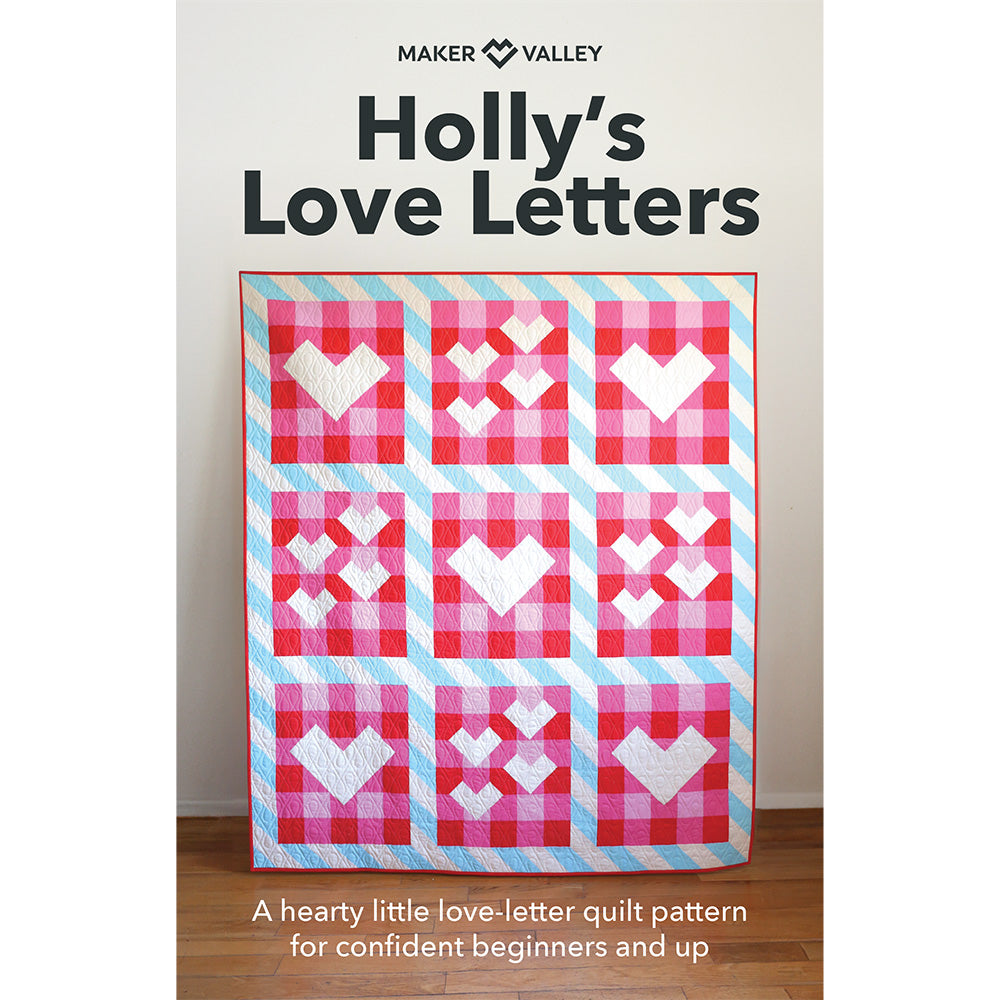
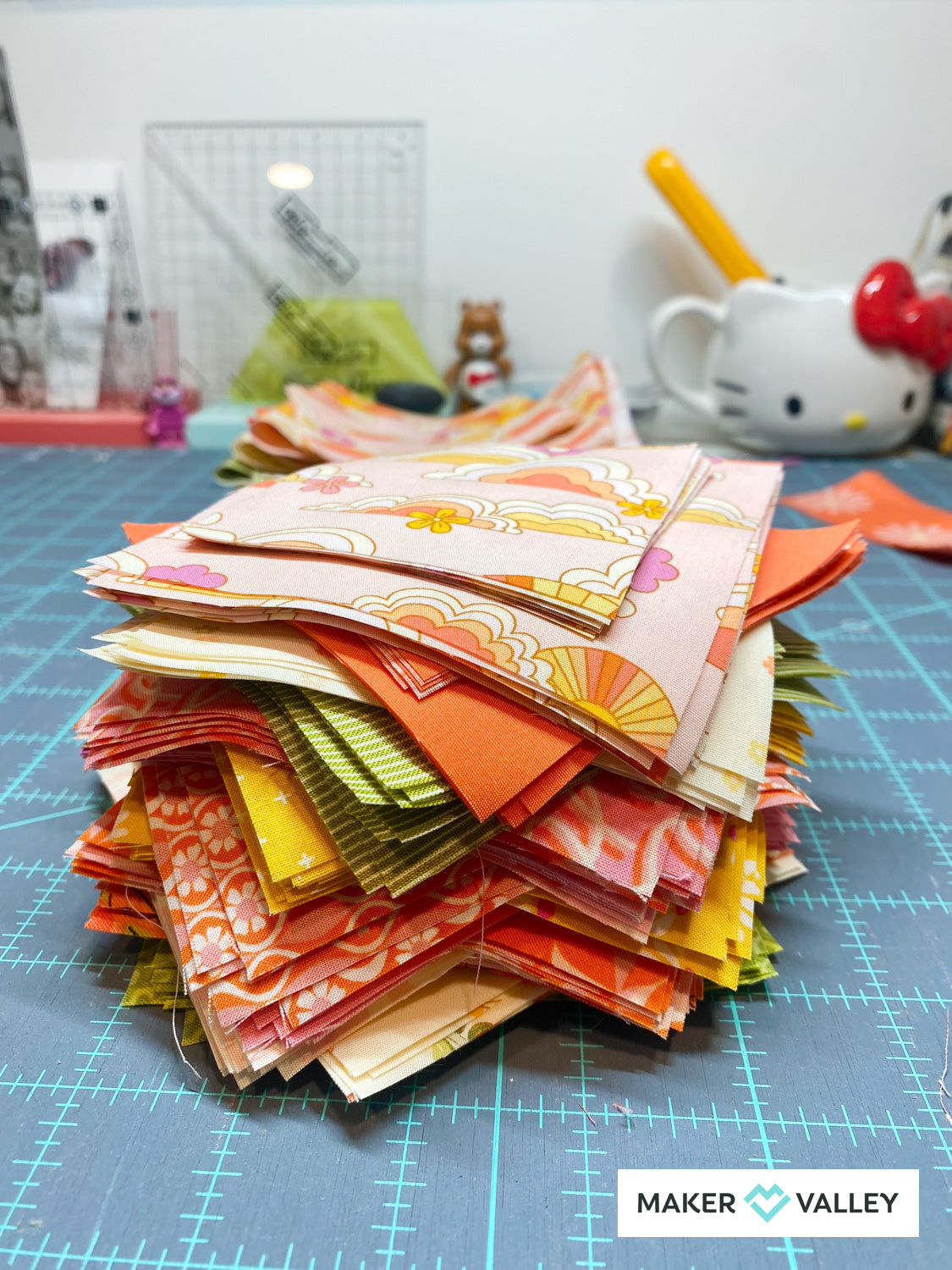
When it comes to creating a beautiful quilt, I've learned that it's important to understand how to place different colored fabrics. The placement of colors can totally transform the overall look and vibe of a quilt—taking it from *that's nice* to OH MY GOSH. In this post, I thought I'd share my six favorite color placement tips.

1. Start with a Color Palette
Before jumping into color placement, it's important to establish a cohesive color palette. Choose a set of colors that complement each other and generate the right ✨mood✨ for your quilt. You can draw inspiration from nature, art, photos, or anything that just visually sings to you. I like to use a color wheel and/or color swatches during this step to guide my choices and ensure harmonious combinations.

2. Create Contrast
Contrast is a powerful tool that you can use to add depth and visual interest to your quilt. When deciding where to place different colored fabrics, aim for contrast between adjacent pieces. High contrast creates a dynamic and vibrant effect, while low contrast offers a more subtle and soothing look. Experiment with different combinations of light and dark, warm and cool, or complementary colors to achieve the right contrast level.

3. Consider the Pattern
The quilt pattern itself can (and should) influence your color placement decisions. If the pattern features an intricate/complex design, consider using fabrics with solid colors or subtle prints to avoid overpowering the pattern's complexity. On the other hand, if the pattern is simple, you can incorporate bold or vibrant fabrics to inject personality and excitement into your quilt.

4. Balance the Color Distribution
To create a visually appealing quilt, aim for a balanced distribution of colors throughout the design. Avoid clumping fabrics of the same color together—it can create visual imbalance and detract from the overall feel. If you are creating a multi-colored quilt, distribute colors evenly, so that no one color dominates. I shoot for balanced distribution to create a harmonious and cohesive look.

5. Create Focal Points
Just as in any art form, creating focal points in a quilt can draw the viewer's attention and create visual interest. Consider placing vibrant or bold-colored fabrics strategically to highlight specific areas or elements of the quilt pattern. Focal points can be used to emphasize intricate details, showcase specific blocks, or to visually guide the viewer through the quilt.

6. Remember the Quilt's Purpose
The purpose and setting of the quilt can (and often should) influence color placement decisions. If the quilt is intended for a specific room or space, take into account the existing color scheme. Also consider the quilt's purpose, whether it is meant to be a cozy winter quilt or a bright summer piece, and then choose colors accordingly.
Conclusion
I've found that by following these rules, I've been able to take my quilts from good to great (when all goes well). Beyond these tips, my big piece of advice for you is this: experiment, trust your instincts, and allow your creativity to shine through! Happy quilting!


Leave a comment
This site is protected by hCaptcha and the hCaptcha Privacy Policy and Terms of Service apply.